Beautii
Redesigning the luxury beauty on-demand platform for Beautii.co
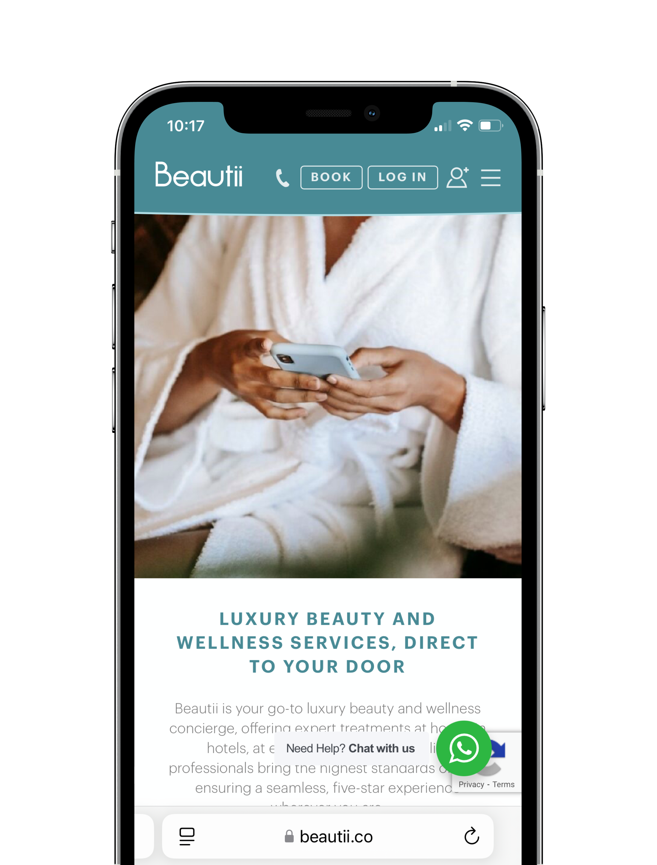
Beautii.co is London’s leading concierge service, offering luxury at-home beauty treatments. They work with top celebrity make-up artists, hairdressers and beauty experts to provide services such as massages, facials, spray tans and more, at your home, office or hotel.
Role: Lead UX Designer
Tools: Figma, Miro, Typeform, Magic Patterns & Zoom
Timeline: 8 months (January - August 2025)
Business Objectives
The Problem
My brief was to identify usability issues and redesign the booking flow to make it faster, clearer, and more engaging for their target audience: women aged 30–70.
We wanted to improve several specific metrics - increase conversion rate of consumers paying for services on Beautii’s website, enhance customer satisfaction and simplify and streamline the booking process.
Despite high interest in their services, Beautii’s booking conversion rates were below expectations. Testing and research revealed users were facing friction points that made it harder to complete a booking. Early login prompts, limited visibility of services prior to account registration, lengthy appointment request forms, unclear error messaging and missing trust signals (e.g. reviews, limited information on beauticians) were all causing drop-offs.
Goals:
Increase completed bookings.
Improve browsing experience before sign-up.
Build trust through transparent information (reviews, provider profiles).
Reduce booking friction.
Research & Insights
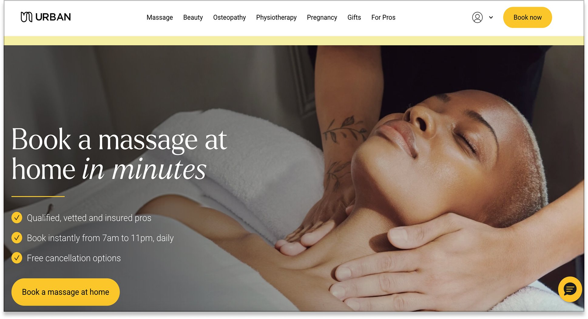
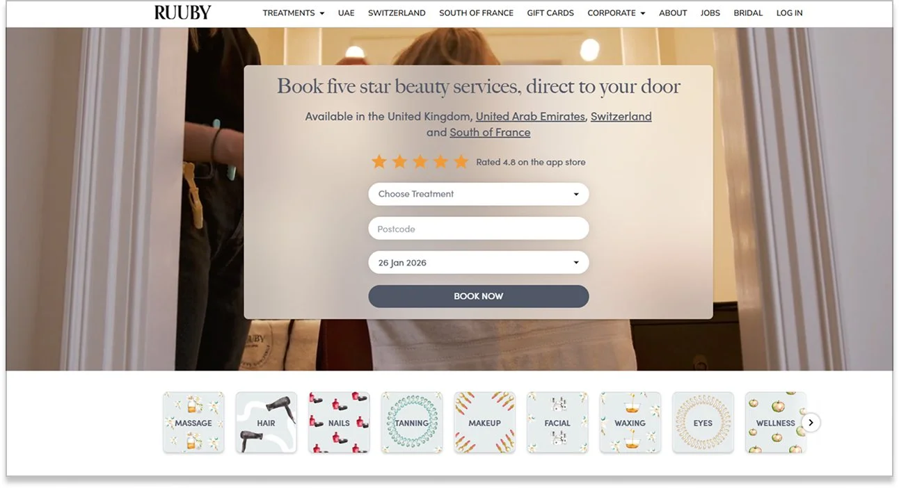
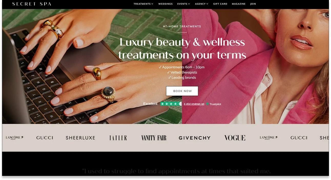
To better understand Beautii’s position within the at-home beauty and wellness market, I conducted a competitive analysis of three of their biggest competitors — Urban, Secret Spa, and Ruuby. The goal was to identify the key differences in their user experience, service transparency and trust-building strategies. By comparing these platforms against Beautii, I aimed to uncover opportunities to enhance Beautii’s digital experience, particularly around how users discover services, evaluate therapists and book treatments with confidence.
Key Findings:
Competitors allow browsing before sign-up.
Location checking happens early in flow.
Reviews and provider profiles are prominent.
Beautii’s current booking process relies heavily on manual coordination. Customers typically need to submit an enquiry form, send an email, or call to confirm an appointment.
Instant booking, enabling users to view real-time availability, receive instant confirmations, and book same-day appointments directly within the platform, was available on Urban, Secret Spa, and Ruuby.
These competitors all offered several features that Beautii currently lacked, including:
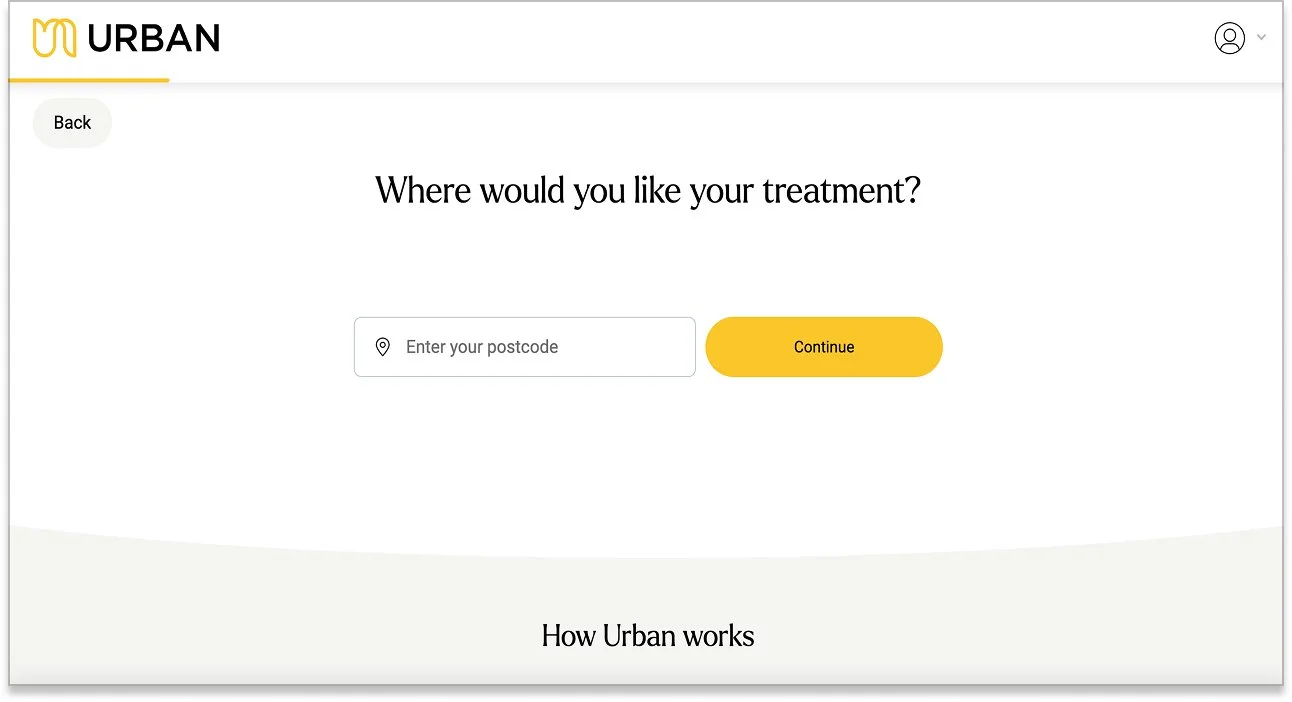
Geographic Coverage Transparency
Urban provides a clear service area and postcode check early in the booking journey, setting accurate user expectations.
Survey
A survey of 35 women aged 30–60 was conducted to evaluate the usability of Beautii.co using quantitative and qualitative questions. 56% of participants said they booked beauty services online at least once a month and were asked to explore the site, assessing:
Ease of finding treatments.
Clarity of treatment descriptions and pricing.
Any points of confusion or frustration.
Suggested improvements.
Overall design and navigation.
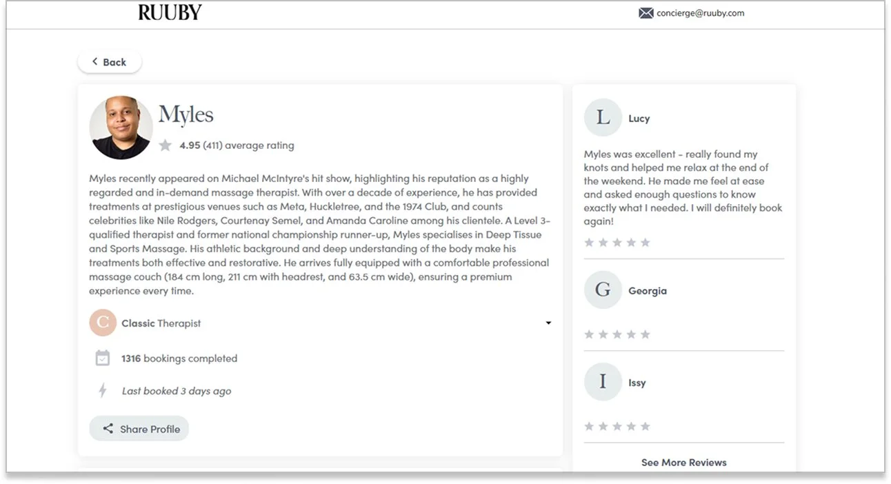
Therapist Profiles & Trust Signals
Therapist bios with their qualifications and experience, and customer ratings are visible before booking on Ruuby — helping users build confidence and trust.
Service Visibility Before Signup
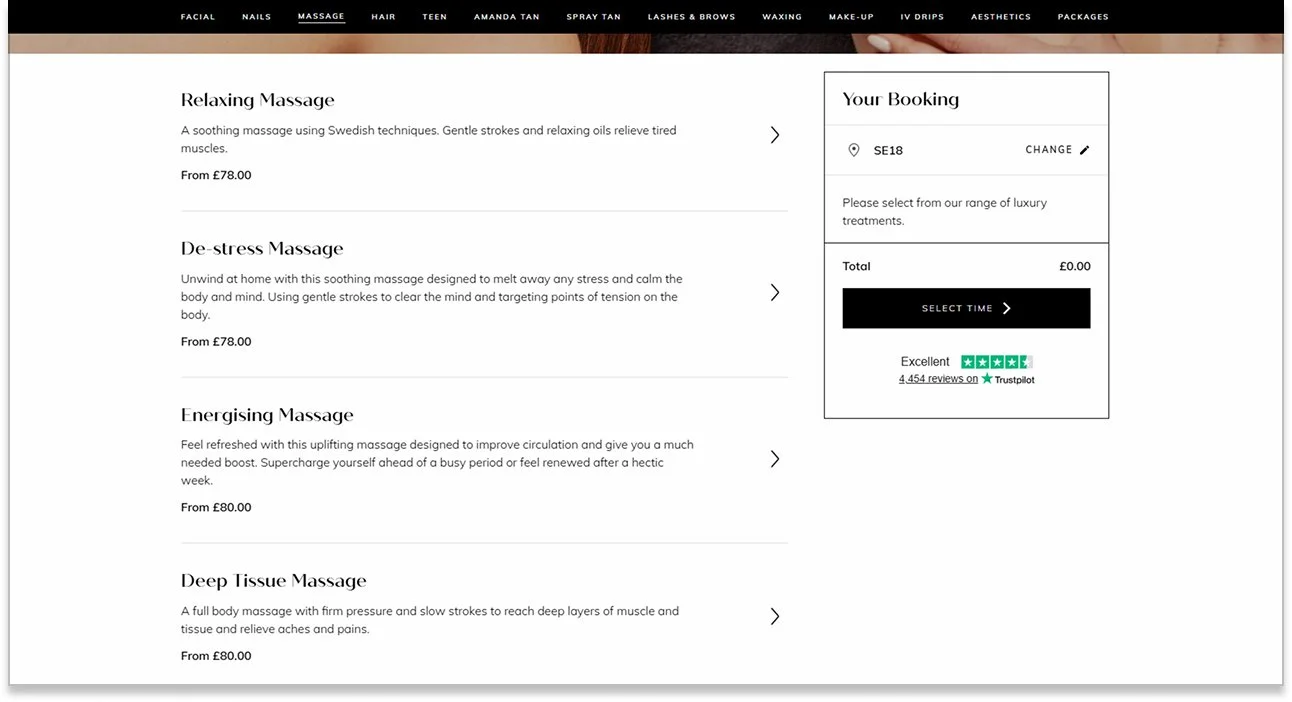
Competitors allow users to browse full treatment lists, see pricing, therapist bios, and reviews without creating an account.

User Impact Statistics
Percentage of users affected by each issue
👤 Trust – 98% wanted to see who would be performing the treatments.
🧭 Navigation – 94% reported challenges with website navigation.
📅 Accessibility – 94% expected to book treatments without contacting anyone.
⭐ Reviews – 80% wanted more visible customer reviews.
💰 Pricing – 75% found pricing unclear or hard to locate.
📄 Treatment Info – 62% felt the treatment descriptions lacked enough detail.
Usability Testing
To validate Beautii’s current booking flow and uncover real pain points, I conducted usability testing with three women from different age groups and backgrounds within Beautii’s target demographic who all book beauty services regularly, two using desktop devices and one via mobile. Each participant was asked to imagine they were booking an at-home treatment through Beautii, for example a massage, while also exploring what other services the site offered.
The task was designed to replicate a realistic first-time booking experience: navigating from the homepage, browsing services, selecting a treatment, and moving through the booking steps up to just before confirming the appointment.
By observing how participants interacted with the site, I was able to capture their first impressions, moments of friction, and overall satisfaction. This process provided detailed insights into how real customers interpret Beautii’s interface.
-
![]()
Participant 1
40, DESIGNER
“I don’t understand if there’s an error, why the system doesn’t say what caused it and there’s no way to get back and resolve it.” -
![]()
Participant 2
35, COPYWRITER
“I think it seems unnecessary to request personal details before allowing me to browse the site and view pricing.” -
![]()
Participant 3
42, CONSULTANT
“What does beauty and wellness concierge mean? They are providing treatments in your own home as far as I understand it but that literally sounds like they are just turning up and delivering something.”


Usability Testing: Key Findings
Frustration at having to log in before browsing.
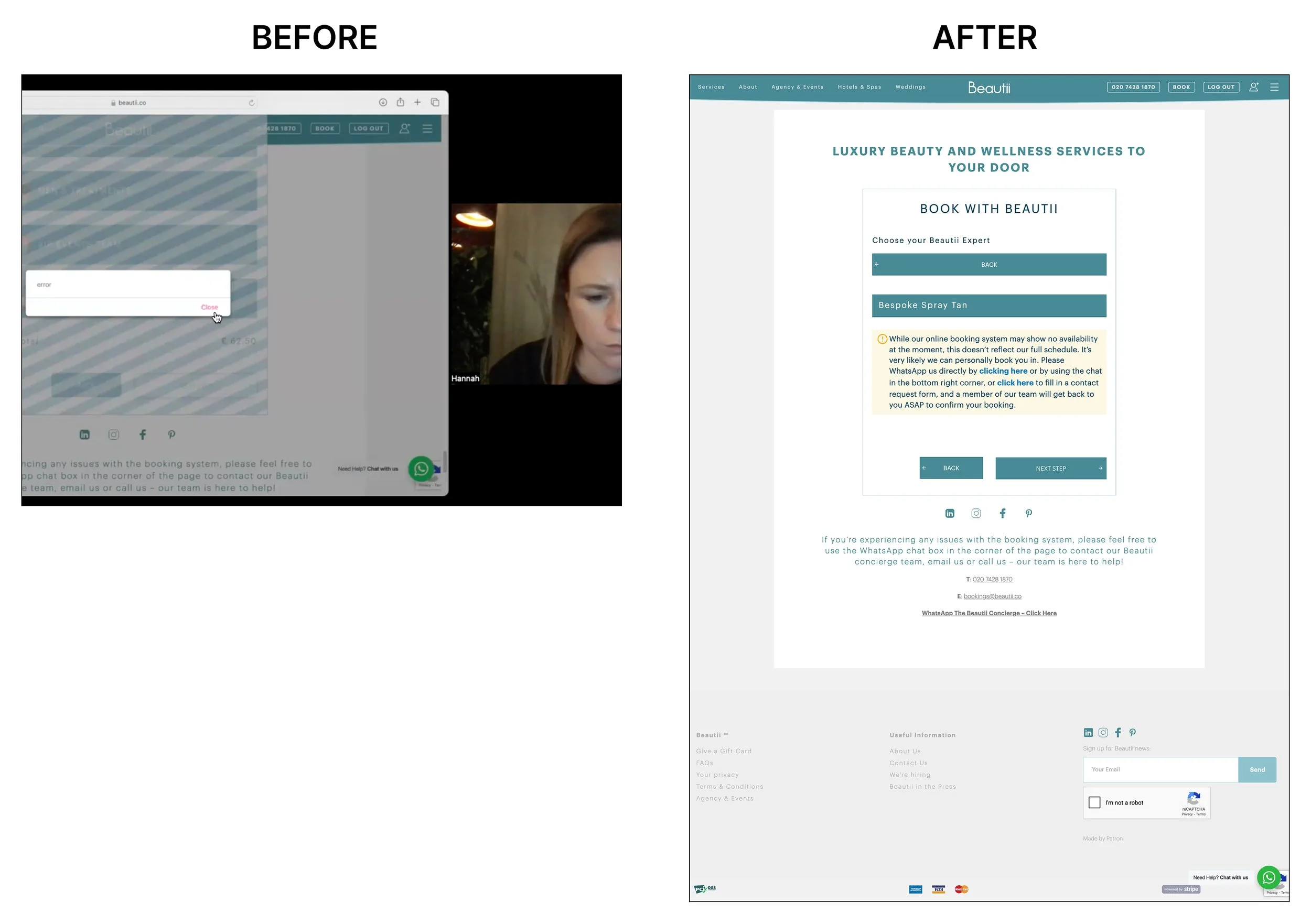
Confusion from vague error messages: (e.g., simply stating "error" without explanation) Participants found it misleading that some services seemed bookable but then resulted in an error message later in the process.
Uncertainty about service availability in their area. Lack of a location checker in the process frustrated users, as they wasted time attempting to book unavailable services.
All participants found the booking process involved too many steps and multiple redirects, leading to confusion and frustration.
Participants expected to see reviews under individual services but could only find them in a less obvious "Customer Love" section.
All participants found the homepage messaging and branding unclear.
Design Process
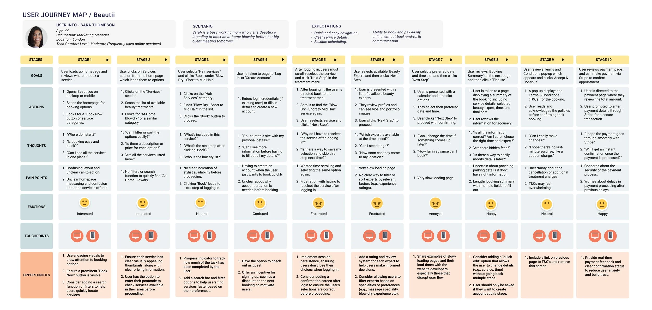
Customer Journey Map
Visual representation of the booking process highlighted pain points such as the repeated login steps, confusing navigation and user expectations not being met. This ensured we had the necessary insights to create a seamless and effective journey for Beautii’s ideal customer. The user persona below was developed from the target demographic information provided by Beautii and real world user data collected from my research.
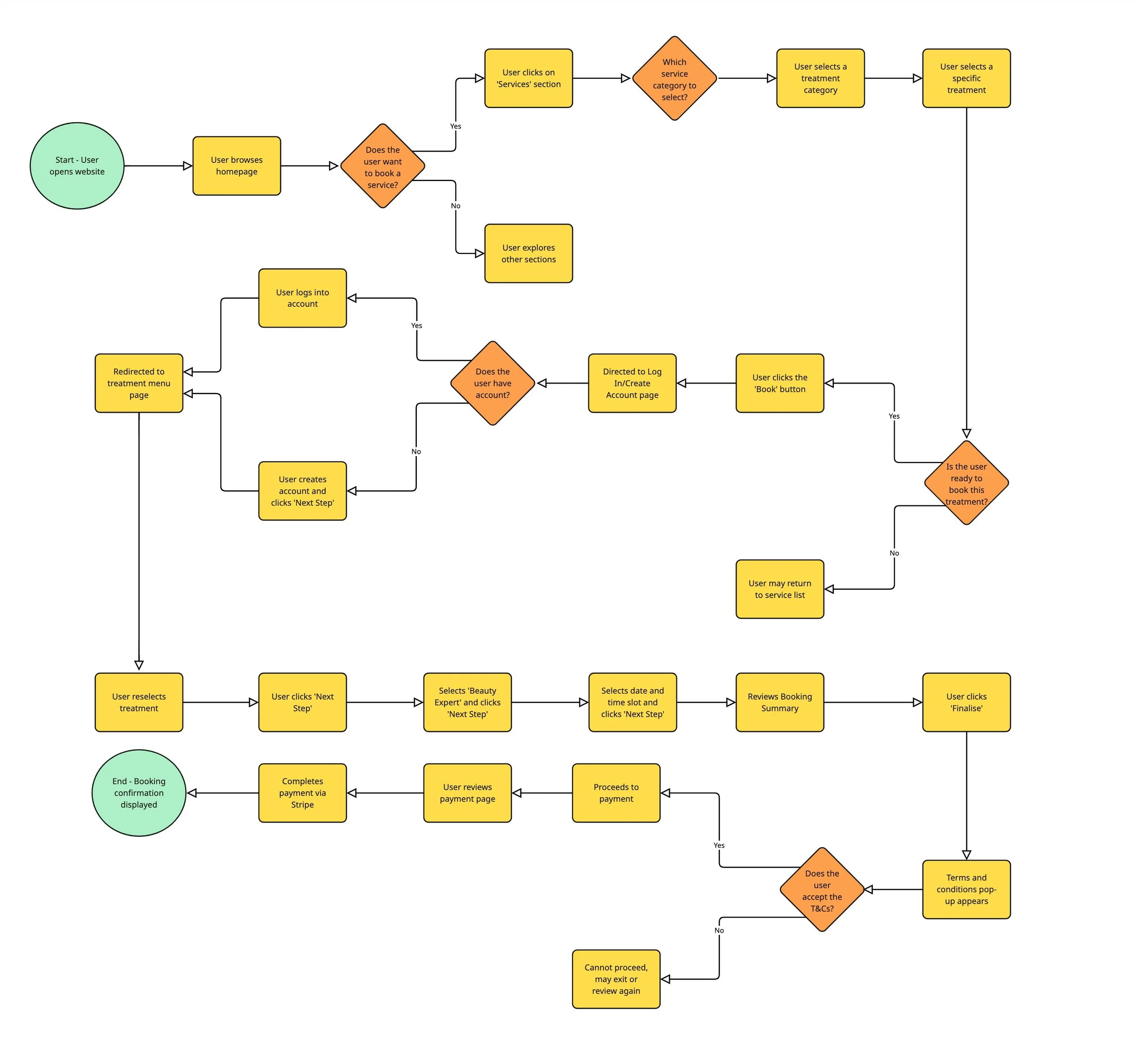
User Flow
This diagram outlined all steps in the booking process to reveal friction points. Several areas where there was room for improvement in the website’s overall flow were identified.
The login process: customers are forced to login or create an account before browsing.
Enabling a location based search at the start of the process.
Preventing the need to reselect treatments from a second treatment menu after logging in or creating an account.
These changes would help users reach their end goal of booking a treatment more quickly and smoothly. The yellow boxes represent an 'Action' and the orange boxes are 'Decisions'.
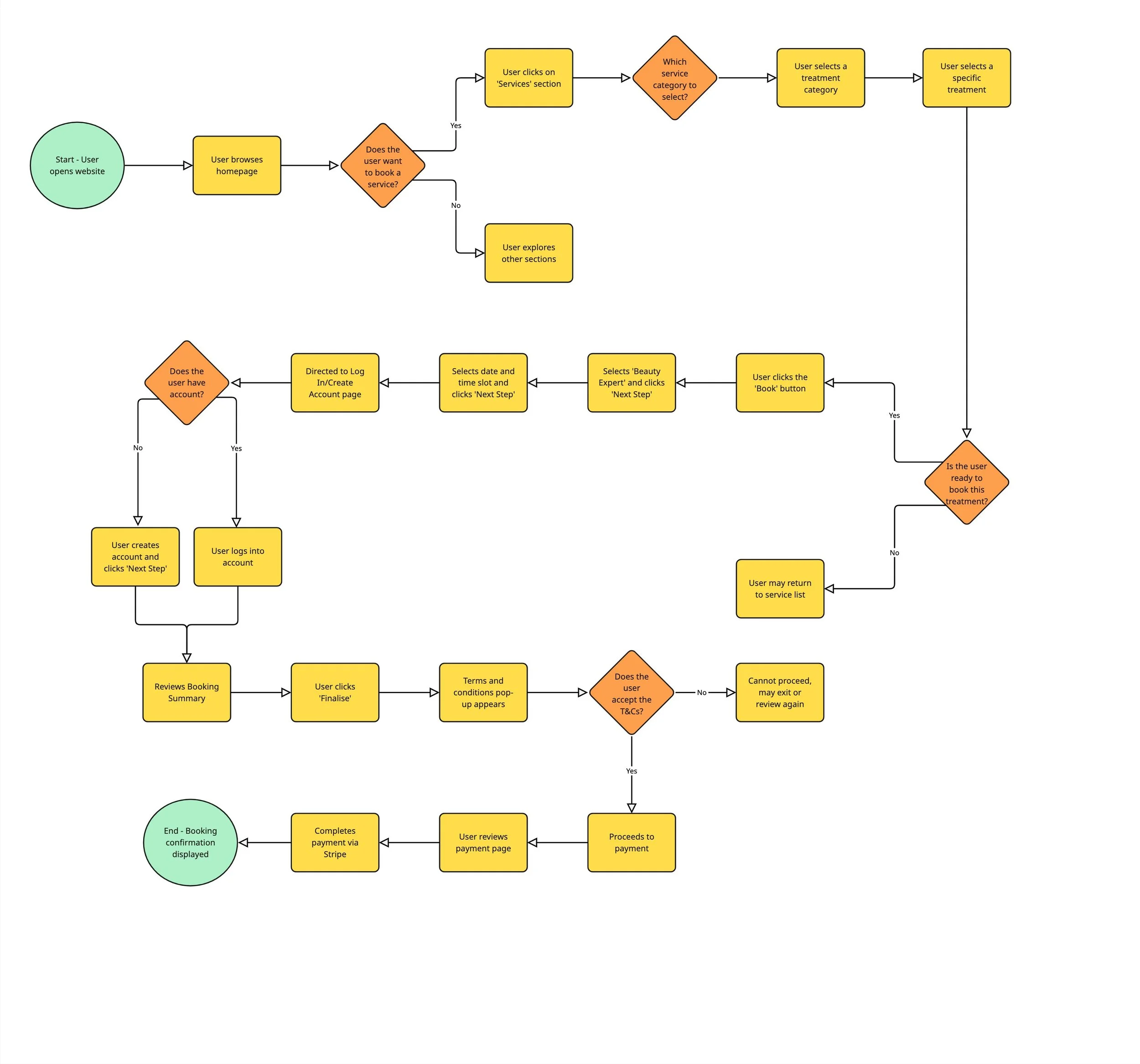
I then created an updated user flowchart. It highlights how removing a few key obstacles can make the user journey faster and more effective. Specifically I removed the prompt for users to log in or create an account before browsing services and also ensuring users don't have to reselect a treatment after logging in or creating an account. Instead, users would only be asked to log in or create an account at the final step before completing their booking and without needing to reselect their treatment. The updated flow now provides a seamless booking experience, reducing friction for users.
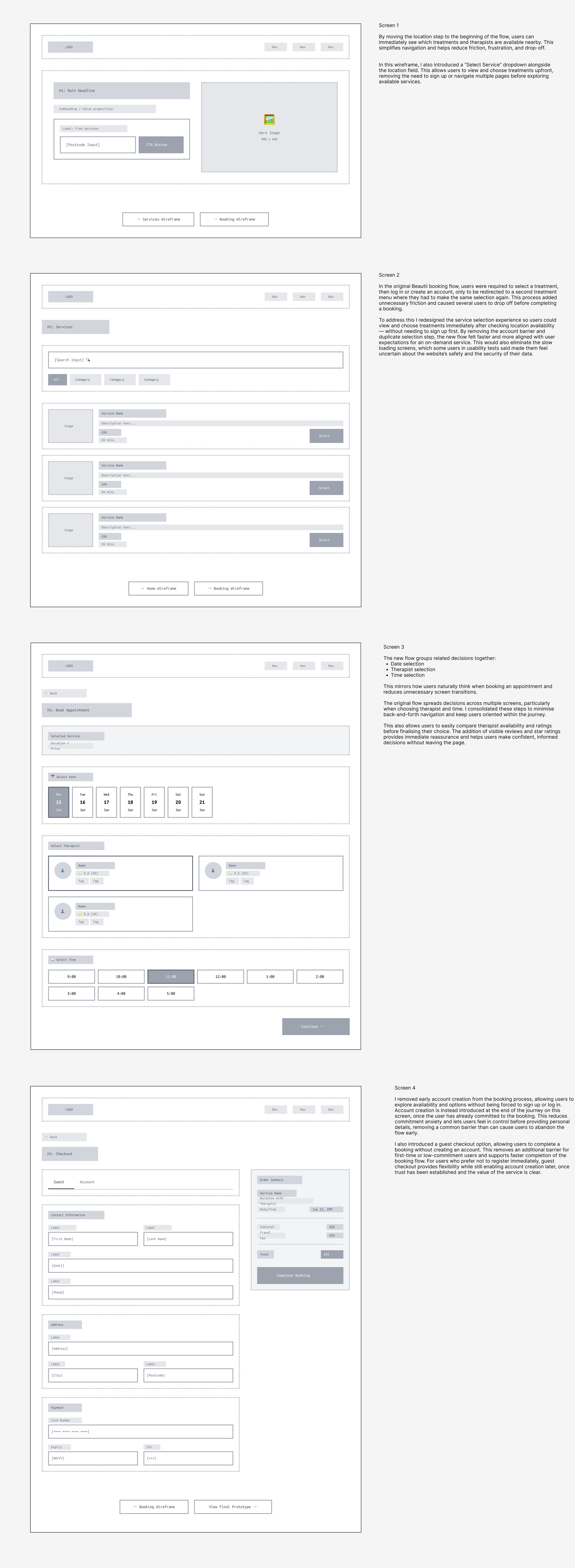
Low-High Fidelity Wireframes
I created low-fidelity wireframes in Figma to explore structure, layout, and user flow before focusing on visual design. Since Beautii does not currently have a mobile app, the brief centered on optimising the desktop experience. I streamlined the booking journey from multiple fragmented steps into four clear, sequential screens.
One key design decision would be a location checker at the very start of the booking flow, directly on the homepage. During usability testing, many participants expressed frustration at discovering service availability only after completing multiple steps — creating an account with Beautii, searching for a treatment, selecting a treatment, and then learning it wasn’t offered in their area. This caused unnecessary friction, abandonment, and wasted time.
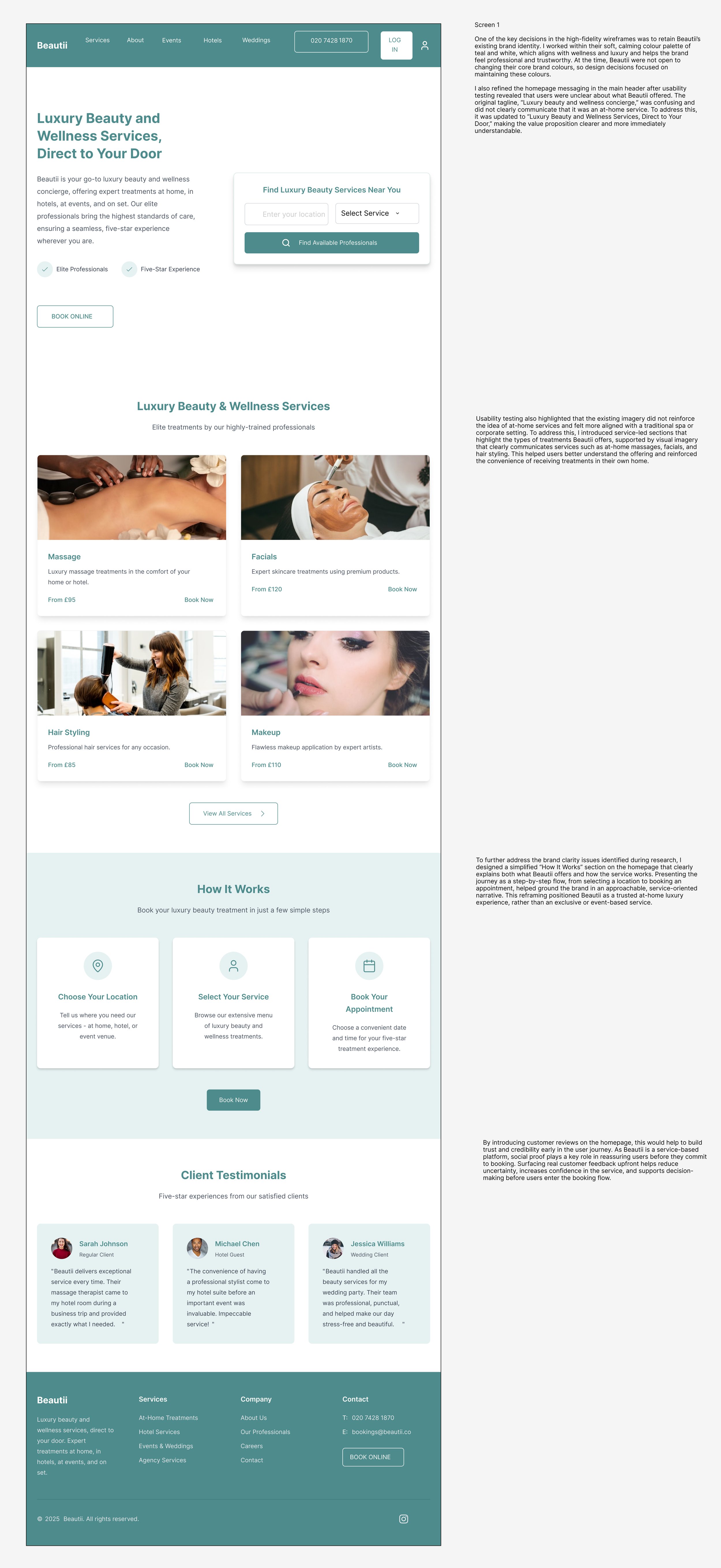
High-Fidelity Prototype
High-Fidelity Prototype
To explore high-fidelity interactions, I created an interactive Figma prototype with simplified navigation and a streamlined booking flow. This prototype included all my key proposed improvements, such as a persistent shopping cart, an upfront postcode availability check, fewer steps and screens, a single unified menu, more detailed therapist information, and the option to browse without creating an account. This interactive prototype was tested internally to demonstrate the improved booking flow.
After validating the structure and flow through low- to mid-fidelity wireframes, I progressed to creating high-fidelity wireframes for each step of the booking journey. These designs translate the agreed user flows into more detailed, realistic screens, allowing the experience to be reviewed as a complete end-to-end journey.
Working at a high-fidelity level also allowed me to refine spacing, typography and visual emphasis, and to ensure the designs aligned with Beautii’s brand and aesthetic.
Creating high-fidelity wireframes for every step of the journey made it easier to identify any remaining friction, test assumptions, and clearly communicate the final experience to stakeholders and developers.
With the final prototype in place, I conducted a second round of usability testing to validate whether the design changes addressed the issues identified earlier.
I tested the updated prototype with the same three participants from the initial usability testing session, allowing me to directly compare their experiences before and after iteration. This helped confirm whether the refinements improved clarity, confidence, and ease of booking.
The second round of testing showed a clear improvement in how users understood and moved through the flow.
“The filters help a lot compared to scrolling before. I wouldn’t have booked on the earlier version, but I would here.”
Participant 1
“This feels more polished and easier to use. I prefer this layout as it feels less overwhelming.”
Participant 2
“I didn’t have to think much. I immediately know what my options are and it is way easier to compare different therapists.”
Participant 3

Design Impact & Practical Outcomes
While the prototype demonstrated clear usability improvements, Beautii faced budget and development constraints that made a full website rebuild unrealistic at the time. Instead, I worked with the team to identify smaller, high-impact changes that could be implemented quickly and still improve user trust, clarity, and overall experience.
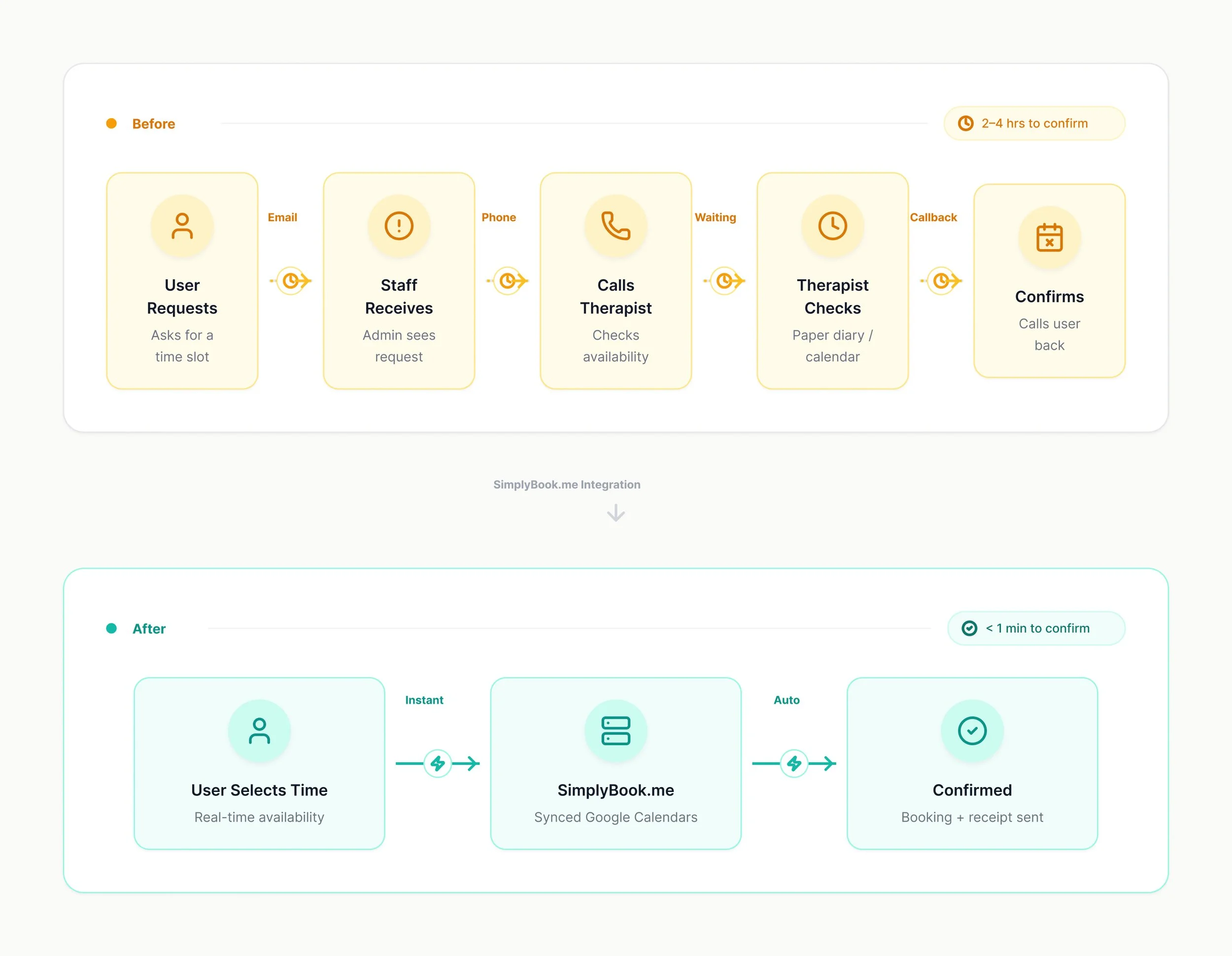
One of the core problems with Beautii business model was that the people at Beautii did not have access to the therapists availability so behind the scenes were having to call to check availability before confirming appointments with users. To avoid this problem I then worked with the web developers in India to introduce the platform: SimplyBook.me and integrate it into the current website to provide the foundation for real-time availability and automation:
Key Capabilities:
Two-way Google Calendar sync for all therapists.
Service area configuration for location-based matching.
Automated confirmations and receipt.
This then meant that as more therapists shared their calendars via SimplyBook.me with Beautii, that users were able to do more instant bookings without having to request a date/time.
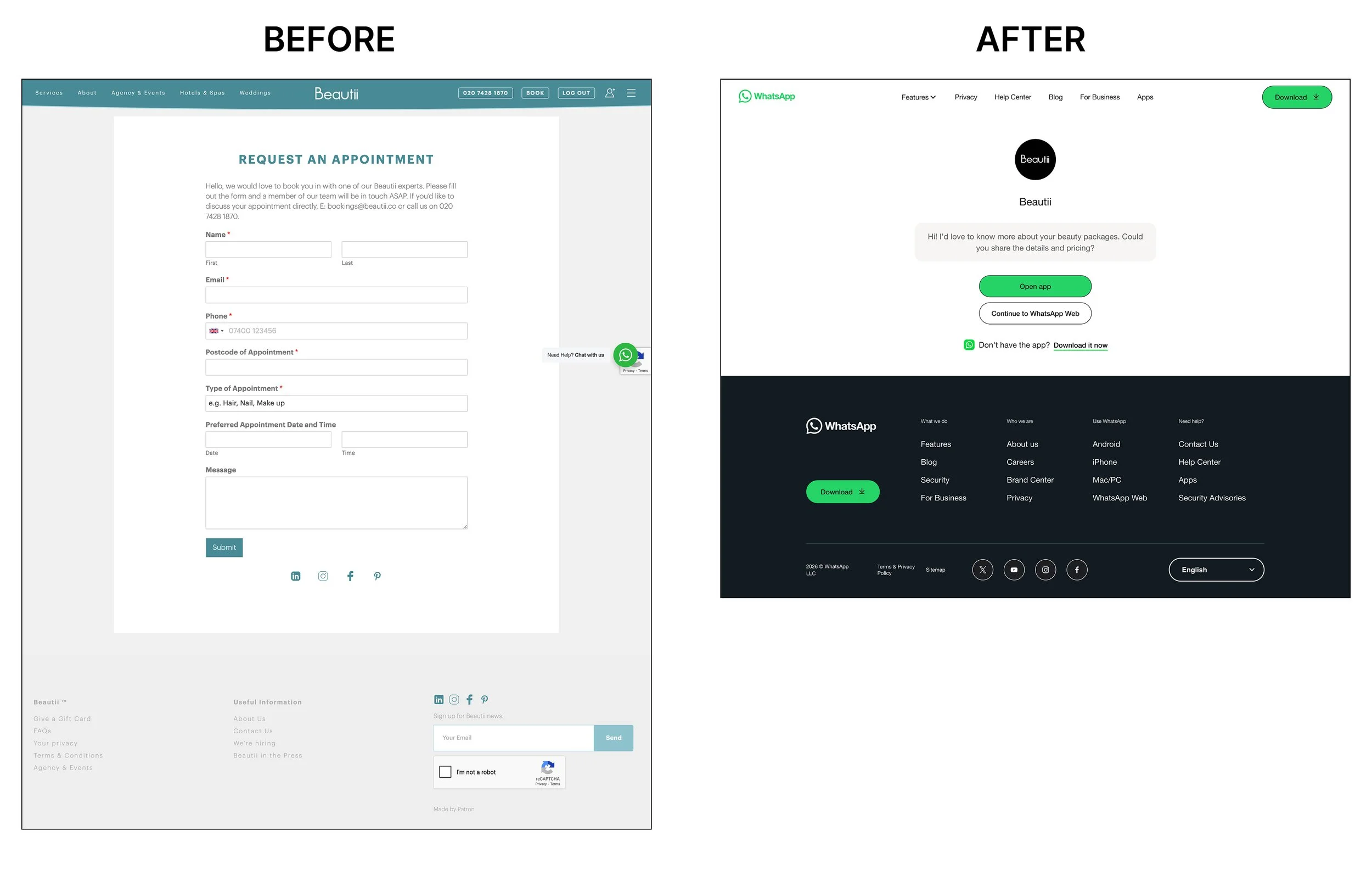
One of the other main changes implemented was removing the contact request form that appeared when users couldn’t find an available appointment and streamlining the booking flow. Previously this form required users to re-enter all their details, the treatment type and preferred date and time. Even though they had already provided this earlier in the booking flow. This created unnecessary friction and frustration.
To improve the experience, we replaced the form with an instant WhatsApp chat feature, allowing users to connect directly with Beautii’s concierge team in real time. This change eliminated redundant data entry, reduced response wait times, and made the experience feel more personal and immediate — aligning with Beautii’s luxury, high-touch brand positioning.
Error messages were originally vague (e.g. simply stating "error" without explanation). We improved the messaging experience by clearly explaining that the lack of availability doesn’t reflect the full schedule, reassuring users that they can still book manually. It also provides clear next steps, offering options to contact Beautii, which helps users continue their booking journey with confidence rather than abandoning it. This more transparent and supportive tone transforms a moment of friction into an opportunity for trust and engagement.
70%
Increase in booking volume, driven by real-time therapist availability and automated WhatsApp bookings.
Results
Beautii was processing approximately 20 bookings daily through a manual system that resulted in 80% of bookings requiring manual processing due to users not being able to instant book and over 8 hours of administrative work. By streamlining more operations via Whatsapp, the transformation of Beautii’s booking system delivered a dramatic improvement in efficiency, customer experience, and financial performance. Within the first three months of making the outlined changes, the results exceeded expectations:
75%
Reduction in manual processing time, cutting administrative workload from over 8 hours per day to under 2 hours.
80%
Of bookings were successfully automated via WhatsApp, freeing staff from constant manual scheduling.
In addition to these results, rebooking rates dropped from 80% to under 20%, eliminating one of the most critical operational bottlenecks. £2,400 in monthly manual processing costs were also eliminated, delivering an immediate financial return.
Beyond the UX changes, Beautii’s booking system unlocked 24/7 booking capabilities, improved therapist utilisation across a pool of 150+ professionals, and significantly boosted customer satisfaction through faster responses and fewer booking errors.
This transformation not only streamlined daily operations but also positioned Beautii for scalable growth, allowing the business to expand geographically without increasing administrative overhead.
Reflection & Next Steps
My time working with Beautii highlighted how UX design and operational improvements must work hand in hand. By addressing both the front-end experience and the back-end booking process, I was able to help create a solution that not only enhances usability but also improves the efficiency of Beautii’s overall business model.
However, as a small company with budget constraints and technical limitations, Beautii is currently unable to implement all recommended features immediately — particularly the postcode-based availability system. To support future growth, I delivered a detailed UX roadmap outlining phased development priorities:
Phase 1 – Location Integration
Introduce an integrated postcode feature early in the user journey so customers only see services available in their area. This improvement will prevent booking errors, reduce frustration, and streamline the overall experience.
Phase 2 – Mobile App Development
Many users prefer to book beauty services on mobile, so a dedicated app would significantly enhance accessibility and engagement. The current desktop-first design limits usability on smaller screens, and a mobile app would allow Beautii to offer a more seamless, modern, and on-the-go booking experience.
Phase 3 – Chatbot
Since 70% of bookings come through WhatsApp and Beautii promises to answer all WhatsApp enquiries between 9am-9pm, I suggested implementing a chatbot that handles the entire booking flow which can be done during out of office hours. This would ensure that no potential bookings are lost out of hours and means there is 24/7 support. This prototype I built in Figma shows the example automated conversation flow.
These phases form the foundation for Beautii’s long-term digital strategy ensuring that future enhancements continue to prioritise both user needs and operational efficiency.
Below is an interactive prototype of the proposed Chatbot for Phase 3.