Redesigning a hotel booking website
Role: UX Design
Tools: Figma, Miro, Google Forms & Zoom
Team: Solo student project assigned by UX Design Institute
Timeline: 6 months (November 2023 - April 2024)
Assignment to redesign a hotel booking website. Task given by the UX Design Institute for the Professional UX Design Diploma. The client and brief are fictional.


DISCOVER
The Problem
The current hotel booking website landscape should provide a seamless and intuitive user experience, but instead many hotel booking websites can result in high abandonment rates, user frustration and lower conversion rates. Customers may find it difficult to search for hotels, compare prices, or complete bookings efficiently. The navigation can sometimes be confusing, and key features such as filtering options, room details and customer reviews are not always easily accessible or clear.
Competitor Research
Analysing competitors provided valuable insights into industry standards and opportunities for improvement in the hotel booking process. I conducted a competitive analysis of three hotel booking websites, Booking.com, Hotels.com, and Airbnb.com, to gather insights for designing my own website. The primary objective was to understand the competitive landscape and identify potential user challenges throughout the booking process. My analysis focused on the journey from the homepage to the booking summary.
Strengths:
User-friendly search experience.
User reviews guaranteed to be from actual guests as people can only post a review there if they have first booked through the site.
Weaknesses:
Overwhelming amount of filters.
Manipulative sales tactics ("Only 3 rooms left on our site!")

Strengths:
Loyalty programme offers free reward stays and member discounts.
Shows hotel star rating so you can find the best one.
Weaknesses:
Not as many listings as some hotel booking sites.
If you want to redeem your free nights you have to use the app.

Strengths:
Unique properties such as treehouses and boathouses.
Unlike a hotel, where you often just speak with customer service when you book, you usually get to communicate directly with the host of your Airbnb.
Weaknesses:
Results do not always match with your filters.
Additional fees such as cleaning fees and hospitality tax.
Surveys
A total of 50 participants were surveyed on their experience of booking hotels to gather research data, both qualitative and quantitative, in an aim to understand potential hotel booking issues and identify improvement opportunites.
70%
50%
85%
User confusion
Surveyed users reported feeling confused and disorientated during the hotel booking process, indicating a need for a clearer process with insufficent search options, filters and results list.
Drop-off rate
Users had abandoned using certain hotel booking websites before completion, due to the booking conditions not being clearly evident or visible or a complicated booking process, underscoring the urgency to streamline and simplify the flow.
Too many options
Users felt overwhelmed by the number of filters or options presented with their search results, suggesting a need to prioritise certain filters.

Usability Test
After the initial stages of research I then chose to recruit a test participant for a usability test to evaluate the experience of hotel booking on two different hotel booking websites. In total three usability tests were analysed - two by the UX Design Institute (UXDI), one by me.
For all of them, notes were taken and the results evaluated. The UXDI tested the websites of Barcelo and The Doyle Collection. I had my participant test the websites of Booking.com and Airbnb.co.uk.
All tests took place remotely via zoom and were recorded. With the help of my script, I guided the participants through the test. This contained the procedure with tasks and questions for the users to perform and answer respectively. My main goal was to ensure that the user felt comfortable to share their thoughts.
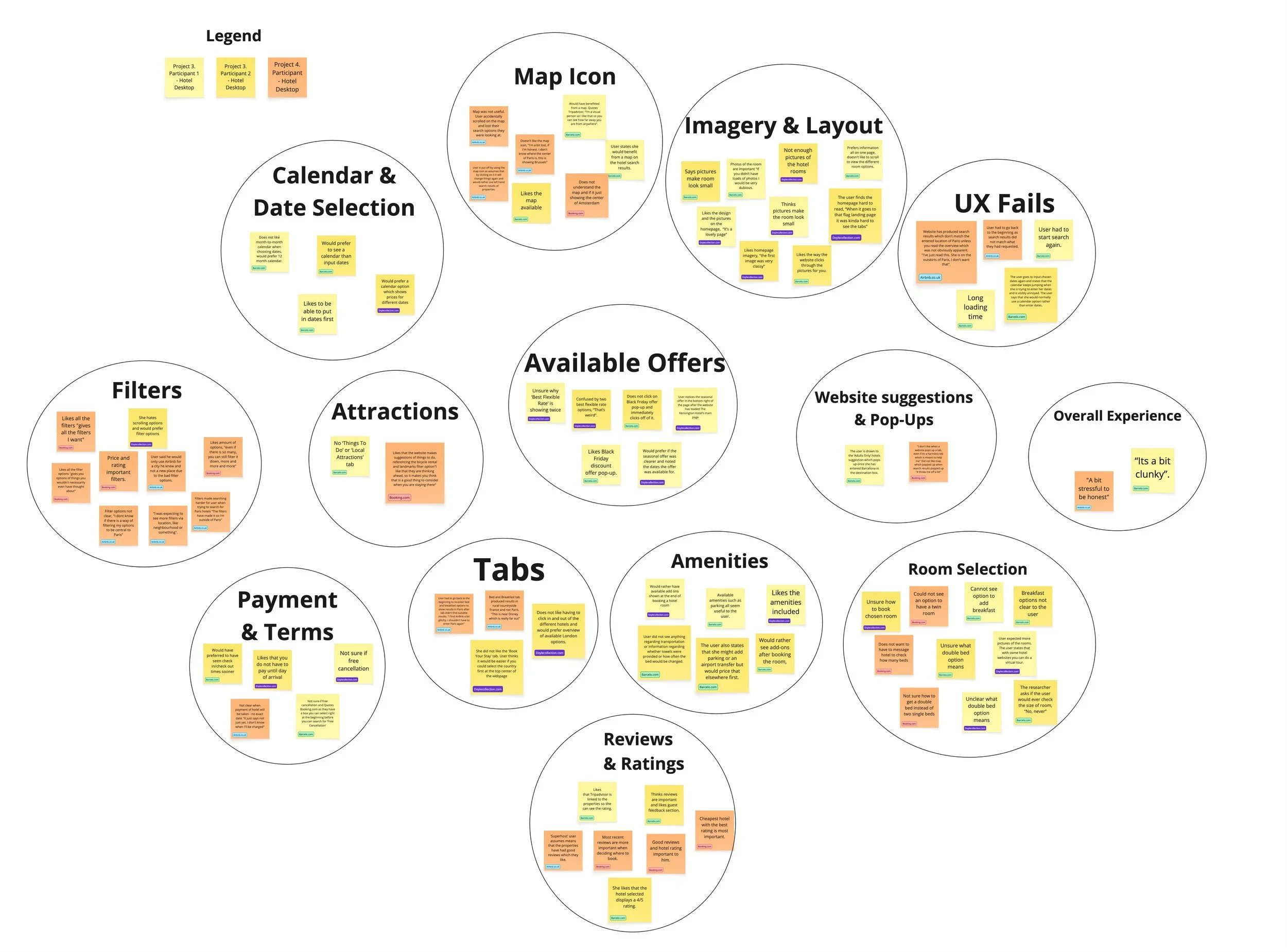
Key Findings
The key findings from the usability tests conducted for the hotel booking websites Barcelo, Doyle Collection, Booking.com and Airbnb.co.uk included:
Common Strengths
Visual Appeal: Websites were appreciated for their imagery, which created a premium feel.
Navigation to Specific Sections: Features like maps, room details, and rates were accessible.
Reputation Tools: Links to third-party reviews (e.g., TripAdvisor) enhanced user trust.
Common Pain Points
Lack of Clarity: Users often struggled to locate key information such as breakfast options, cancellation policies, or detailed room descriptions.
Booking Flow: Both websites required multiple steps to locate and select preferred options, leading to user frustration.
Inefficient Filtering and Comparison: The lack of effective filters (e.g. free cancellation) and the inability to compare multiple hotels easily.
Key Improvement Opportunities
Streamline Booking Flow: Allow filters for essential features like breakfast, free cancellation, and room types upfront. Consolidate add-ons into a summary page at the end of the booking process.
Enhance Transparency: Provide clearer labels for cancellation policies and included amenities. Offer more detailed photos and virtual room tours.
Improve Comparison and Navigation: Showcase maps at the start for easier selection. Enable side-by-side comparisons of hotels or rooms.
These findings suggest both websites could significantly enhance usability by focusing on clarity, navigation and upfront transparency in the booking experience.
Analysis
After this I reviewed all the research gathered and created an affinity diagram using Miro to represent what had been learnt so far. The notes were all in relation to the current user experience: goals, behaviours, pain points, mental models, and contextual information. By the end of my affinity diagram session, I had clear groupings that summarised the key themes from my research. This information was valuable for helping me design for the user.
For the next part of my project, I put more structure on my research by making a customer journey map in Figma to paint an overall picture of the most common user experience, highlighting the problems and the positives. This incorporated the research data taken from all of the previous projects. Along the vertical axis, I included:
Positives
Pain points
Mental models
Behaviours
Goals
The emotional graph and user quotes help the reader to jump into the user's shoes and understand where the experience is lacking at a glance. By doing this I tried to identify the most common experience, based on all the information I had gathered.

Design
Following this I then took the customer journey map and affinity diagram I developed in the previous projects and attempted to start to solve the problem by reviewing the issues the users uncovered. I then sketched out the ideal user flow, focusing on the most common use case, from the homepage to the booking summary screen. I then used Figma to design the flow digitally capturing every user interaction and screen state in the flow.
After identifying the key issues to be solved in my customer journey map and defining the flow, I then produced sketches of the screens for the booking process and created a list of the screens to be designed from homepage up to the booking summary.
I then created a medium-fidelity prototype from my desktop website to simulate the experience of a working website. I reviewed my flow diagram and screen sketches and designed wireframes for each screen in Figma, then linked those screens together to make the prototype interactive. I was not sure which screen size to use as a starting point for a desktop website and chose the MacBook Air model. During the prototyping process I then discovered that I was limiting myself on my ‘Search Results’ page due to my design and therefore was only able to showcase one potential hotel in my search results.